Twenty Years of Evolution in Pricing
You see it in the headline news every day: ‘Inflation is out of control’, ‘the Real Estate Market is set up to crash’. Really? Is the Real Estate market in such a bad shape? Let us look at meaningful numbers from the past 20 years and see.
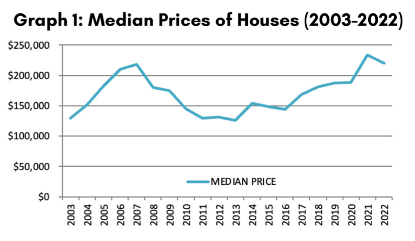 In a nutshell, if you look at the numbers without factoring inflation (see Graph 1 on reverse side), you obtain a very different picture from the one you see when you factor in inflation (see Graph 2 on reverse side). This adjustment is needed because most prophets of doom use the real estate crash of 2005-2008 as their argument for an impending crash… But $1.00 twenty years ago, was worth $1.65 today. This is where the misrepresentation stands.
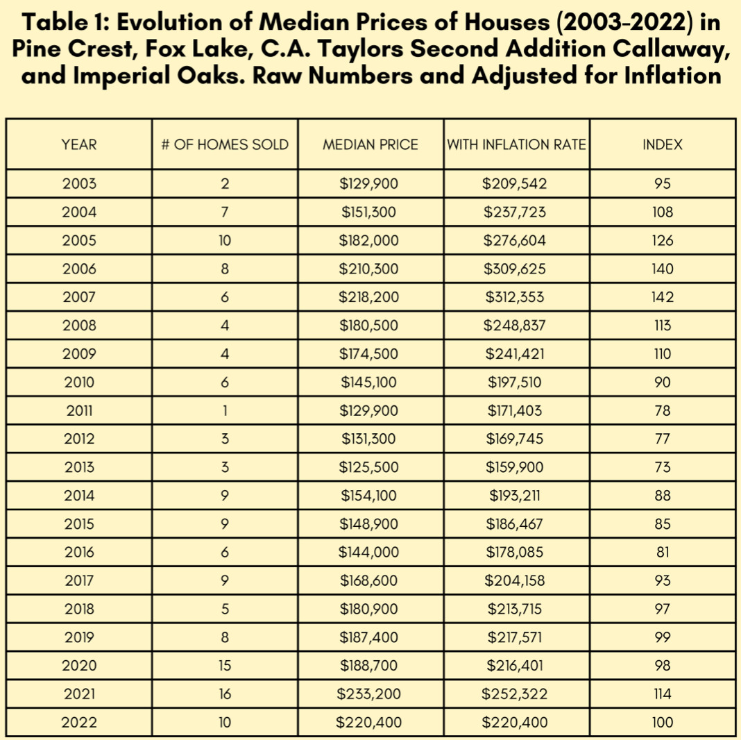
Let’s consider the Median sales prices of houses in our neighborhood over the last twenty years (3rd column of Table 1; also visualized in Graph 1), and then factor in the inflation rate (4th column of Table 1, visualized in Graph 2). The 4th column gives us the yearly market values expressed in 2022-dollar equivalent. These are the real values; each year is expressed in today’s dollars. We are therefore comparing apples with apples in Graph 2; while we compare apples to oranges in Graph 1.
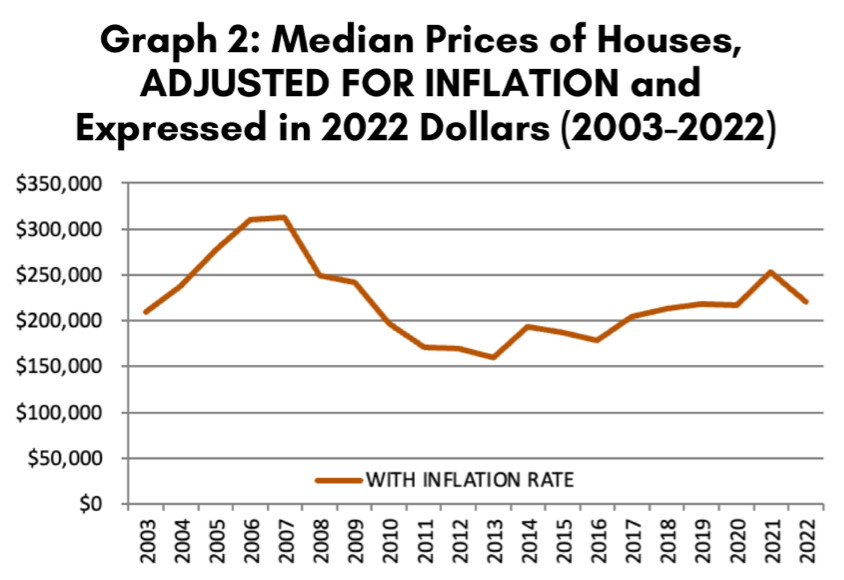 If you look at Graph 1 (the graph NOT factoring inflation), you will conclude that we have reached a bubble similar to the one of 2005. This mishandling of data is what is causing this ‘much to do about nothing’… When a simple look at the “real numbers” of Graph 2, adjusted for inflation, give you an entirely different picture. Our market is much better than it was fifteen years ago – it was 42% overpriced to be exact. Our market today is normal and sustainable.
Now that we understand that Graph 2 is the only meaningful one, let’s look at the chart in Table 1, and at Graph 2 (adjusted for inflation), we will clearly identify the bubble of 2005-2007, followed by the crash or stalling period of 2008-2013, and the subsequent gradual recovery between 2014 and 2017. Then, compare the old cycle with the new cycle in which we live: stability since 2018, with a small ripple in 2021 due to Covid and people moving to Florida. Three obvious differences set apart the 2005-2007 bubble and now:
(1) the overpricing of 2007, with a peak index value of 142, had little to do with our current price index of 100. In other words, comparing values in today’s dollars, prices were 42% higher then, than they are today. This is a HUGE difference.
 (2) Also, the overall population of Panama City Metro has drastically increased in the last twenty years due to remote work habits and migration to NW Florida from other states, bringing stability to the mix. And,
(3) Less mortgages today than before, also means more market sturdiness with cash ownership.
Sleep well tonight, and do not listen to the bearers of bad news!
I have lived in Callaway for the last 20 years and the information was attained using data from the sub-divisions of Pine Crest, Fox Lake, C.A. Taylors Second Addition Callaway, and Imperial Oaks.
