NUMBERS ARE SHOUTING: REAL ESTATE IS HEALTHY!
We hear that the real estate market is set up to crash. With only a quick glance around, this information seems iron-clad. Though, if we do a little digging over the past twenty years, we see a completely different story, and realize that we can’t always get solid information off Facebook. Here is what we discovered:
In a nutshell, if you look at the ‘actual’ numbers without factoring inflation, you obtain a different picture from the one you see when you factor inflation. This adjustment is needed because most prophets of doom use the property values during the real estate crash of 2005-2008 as their argument for an impending crash… But $1.00 twenty years ago, was worth $1.65 of today’s dollar. This is where the misrepresentation stands.
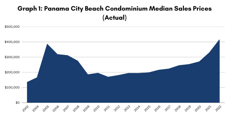
Let’s explain. If you look at Graph 1 (sales prices NOT adjusted for inflation), it looks like we are doomed to repeat the past and the infamous bubble of 2005. After all, numbers never lie… Unless presented in a fallacious or irrelevant way! Yet in using these numbers, the prophets of the apocalypse compare apples to oranges and here is why;
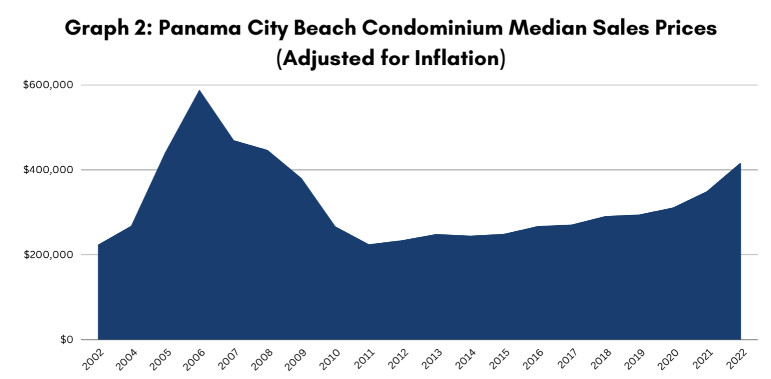
As we saw, $1.00 in 2005 equals $1.65 today. In order to compare apples to apples, we have painstakingly applied the compounded inflation rate to the condominium Median sales prices for each year from 2002 until now (Graph 2). This graph lets us appreciate the ‘real truth’. When we look at Graph 2, we get an entirely different perspective on today’s market. It will even relieve some anxiety you may have if you’re in the market to purchase a new home: we are now 40% cheaper than we were at the peak of the bubble of 16 years ago!
We understand now the mistake made by the prophets of doom when they only see the numbers from Graph 1. Graph 1 gives a skewed view of reality… and it is scary. Graph 2 is just the opposite. It is now easy to spot the differences between Graphs 1 and 2: in Graph 2, we see that the median sales price (in todays dollar) of a condominium unit in 2005 was 41% higher then the median sales price today. Another big difference is that the price change between 2002-2005 was drastic, while the increase from 2011-2022 has been a slow and steady.
In summary:
*2002-2005, drastic increase in value, precursor of the infamous bubble.
*2006-2011, stalling stage, where the market kept collapsing, in search of ‘real values’. This pattern always follows a bubble.
*2012-2015, depressed market, after the big bubble, many investors were scarred and scared.
*2016-2022, the market gradually came back to a happy normal.
*2022, 41% under the 2005 level, is sustainable and reasonable.